Bioness Vector Website
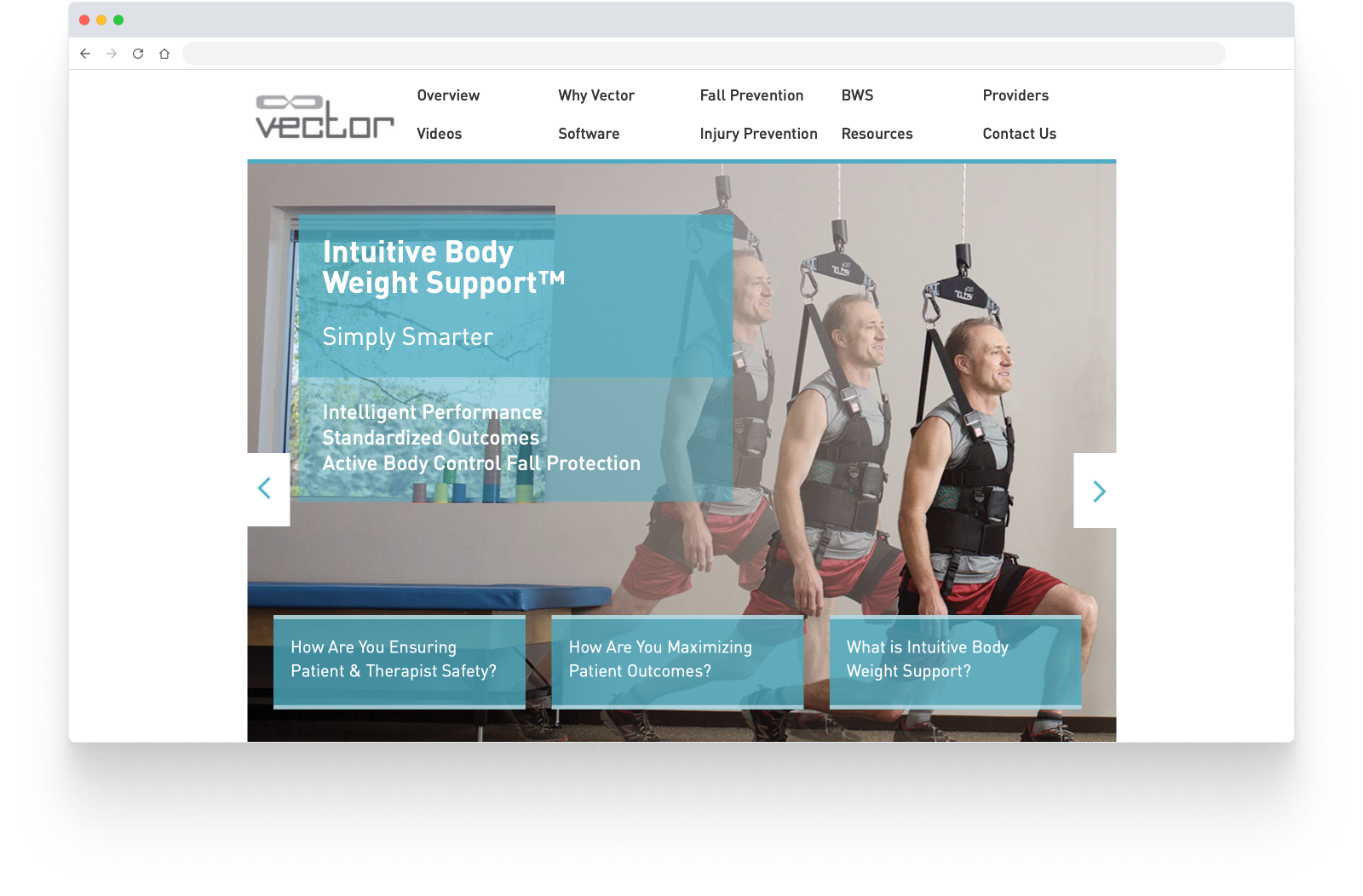
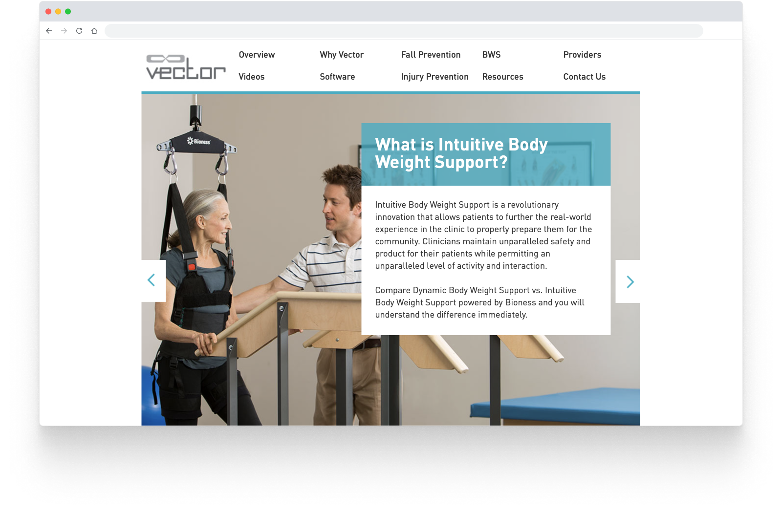
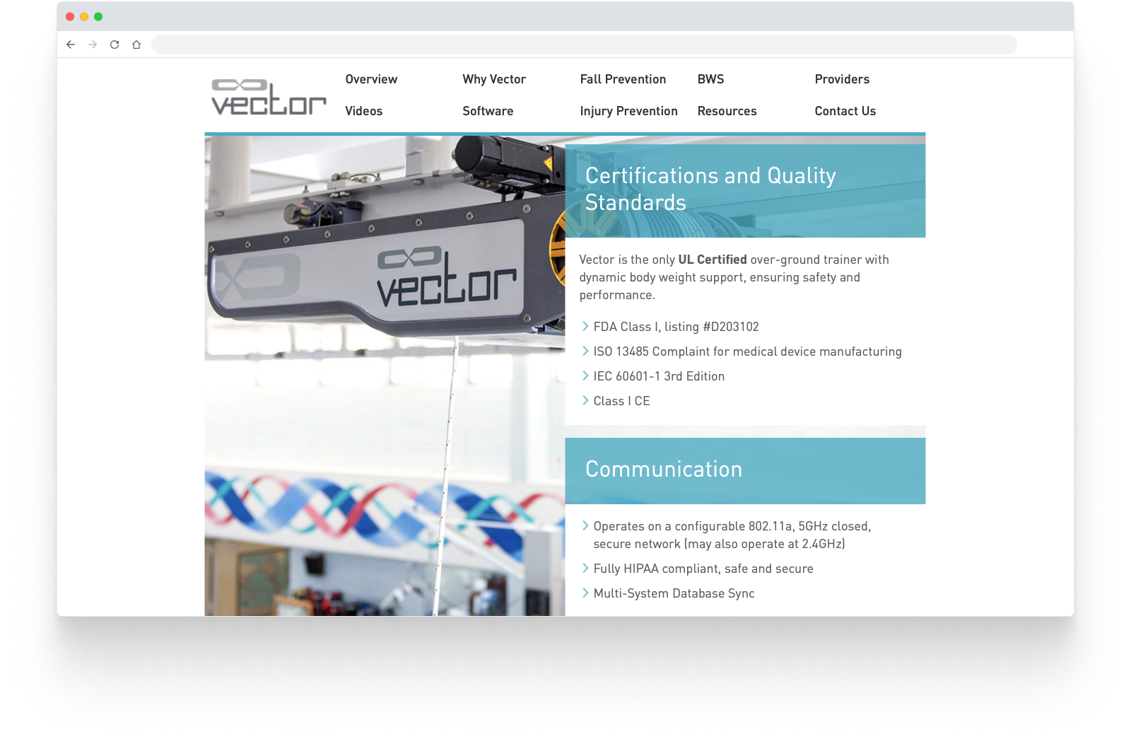
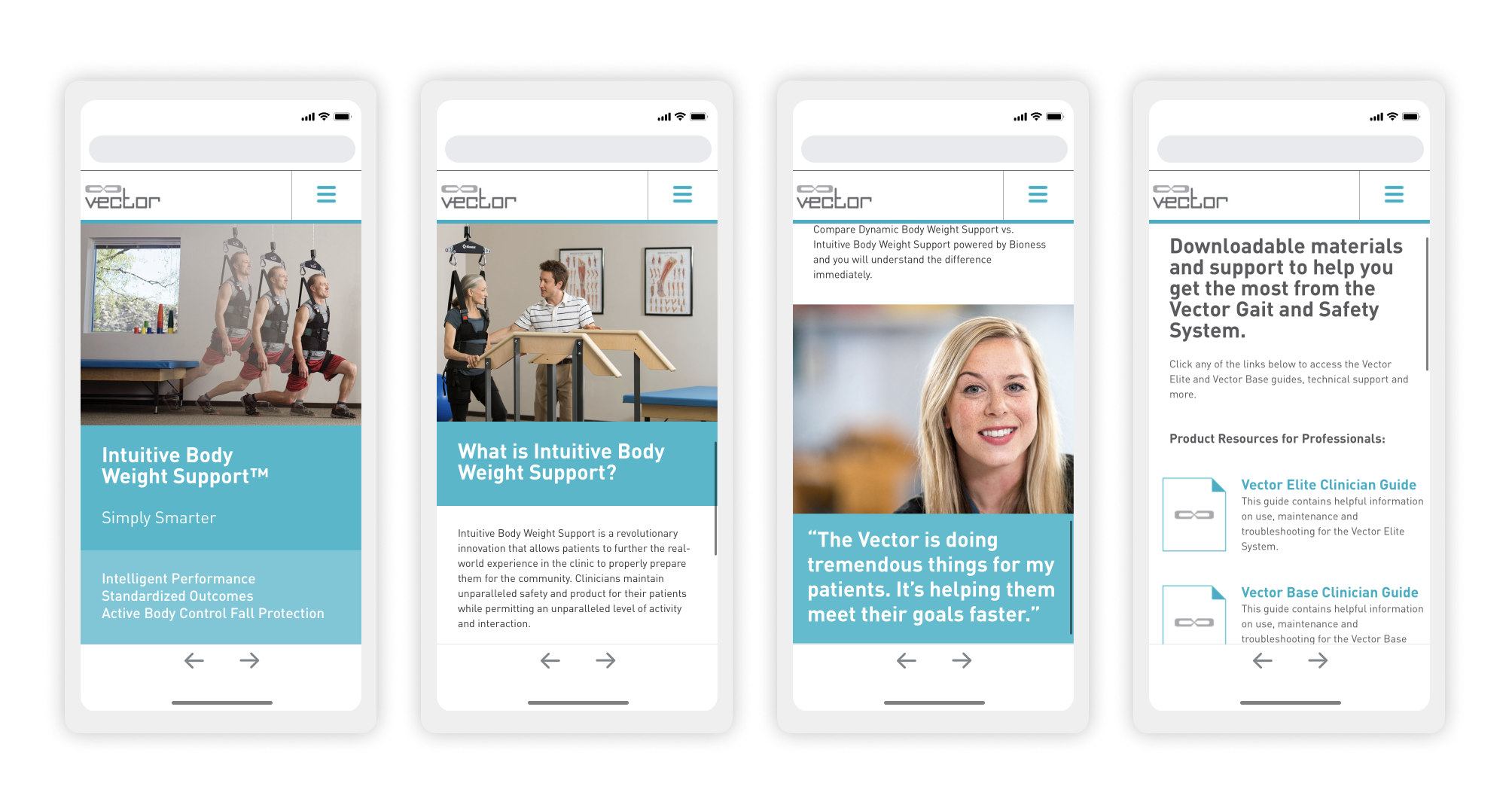
Bioness needed a big refresh for their website promoting the Vector Gait system, which helps people through physical rehabilitation. I designed the front-end responsive website and the accompanying CMS—both developed with TBA Digital.
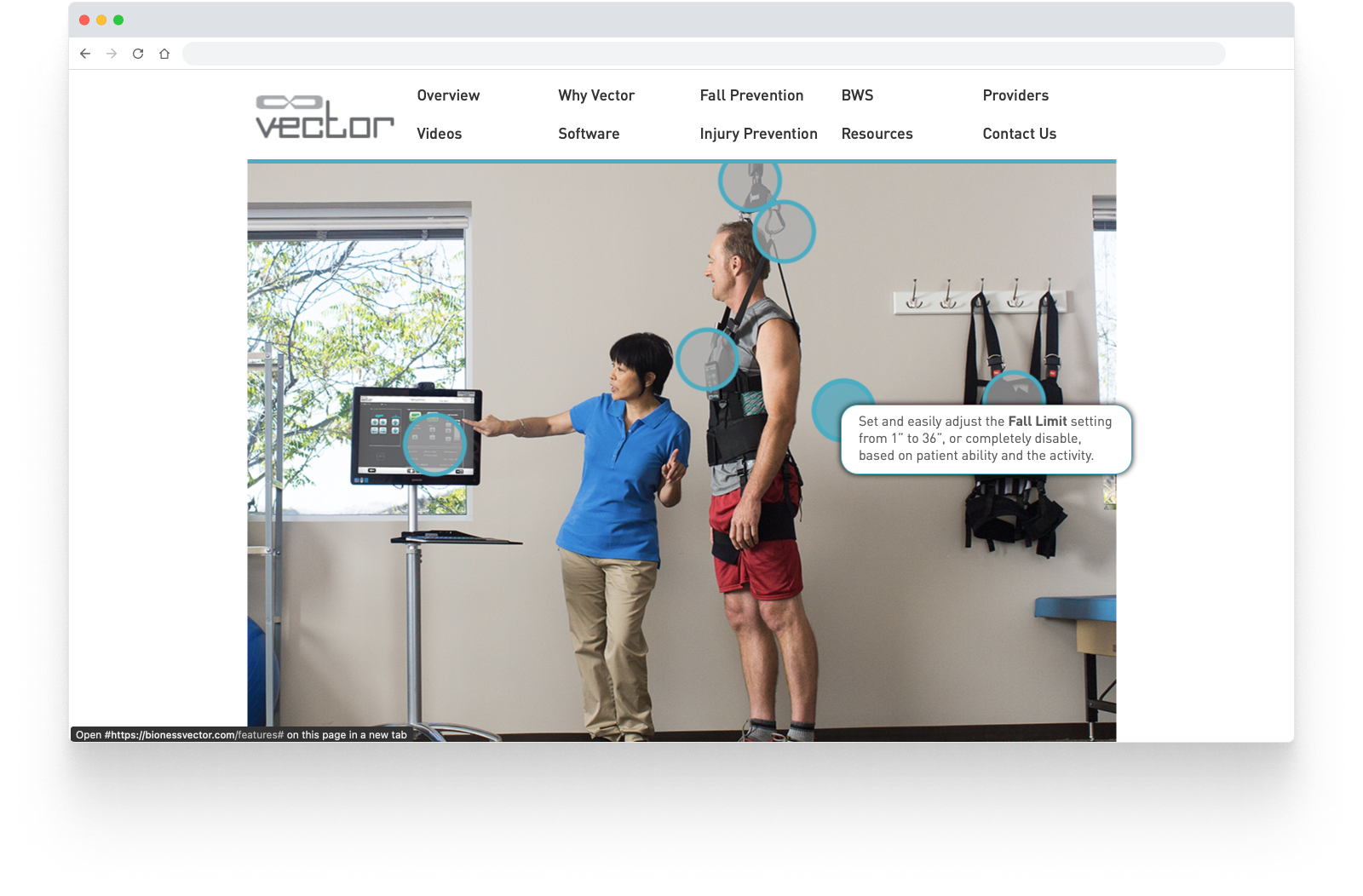
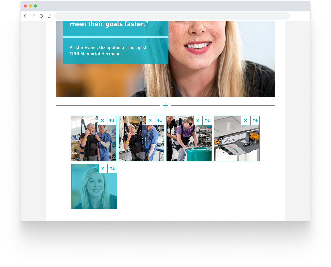
The best way to show a new product like this is to simply show how it's used, in the most honest way possible. Bioness had some great photos showing the system and real patients using it, and which were perfect to spotlight in the design. The copy also played a big part, and was matched with specific images for the best effect.
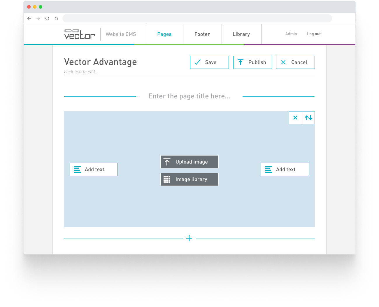
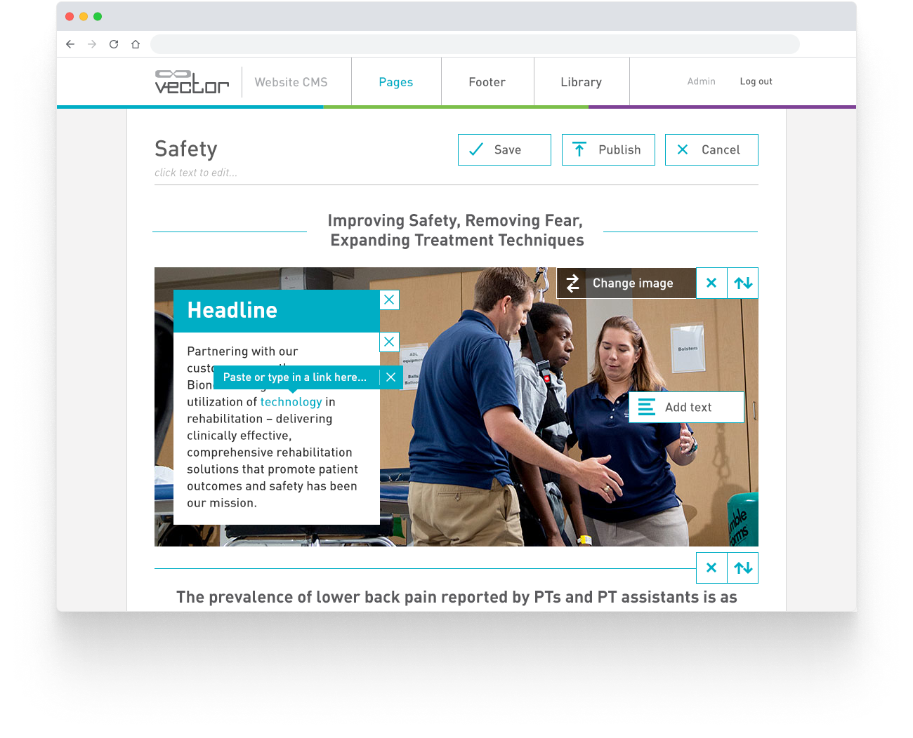
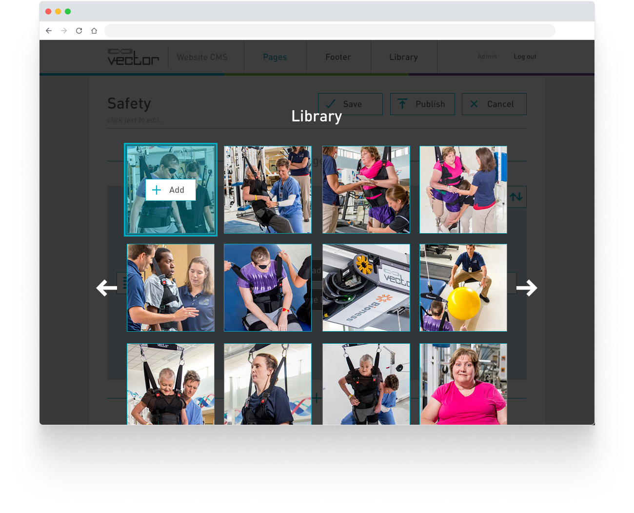
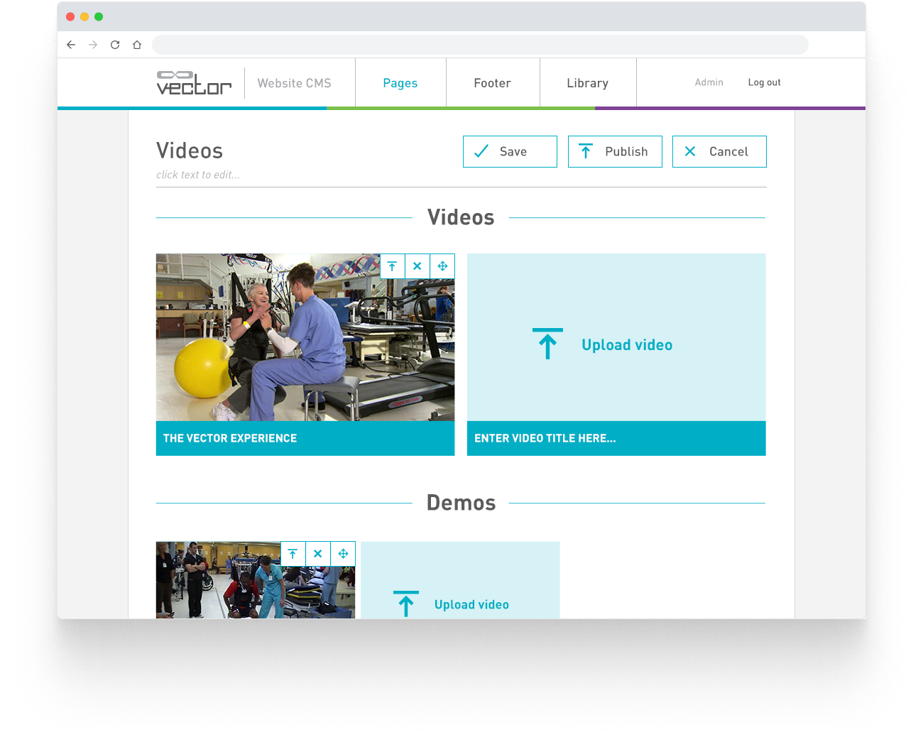
The CMS was designed to fit the front-end functionality. Rather than just use a WYSIWYG editor and call it good, I worked with the client to see what they would actually need to change as time went on. The result was a CMS that didn't overwhelm them with options for formatting and sizing. The pages were separated into templates, and content pieces were separated into blocks for text and images. Although the views in the CMS weren't at a 1:1 scale with the final view, you could get a better idea of the result compared to making changes in a basic editor.
